react nativeでstyled-components使ってみたい
react nativeでのstyled-componentsの使い方を紹介
styled-componentsとは
javascriptでstyleが書ける便利なやつ
こういうのをCSS in JSというらしい
同じようなものにemotionなどがある
どっちを使うか悩んだけど今回はstyled-componentsを使ってみる
使い方
前提としてreact nativeの環境があること
作者はreact native cliを使ってる
まずは準備
$ npm install --save-dev styled-components
準備完了。 実際に書いていく
StyleSheetなどを使って一般的に書く
import React from 'react'
import { View, TouchableOpacity, Text, StyleSheet } from 'react-native'

export default class App extends React.Component {
  render() {
    return (
      <View style={styles.center}>
        <TouchableOpacity style={styles.button}>
          <Text style={{ color: 'white', fontWeight: 'bold' }}>赤いボタン</Text>
        </TouchableOpacity>
      </View>
    )
  }
}

const styles = StyleSheet.create({
  center: {
    flex: 1,
    justifyContent: 'center',
    alignItems: 'center',
    backgroundColor: '#f5fcff',
  },
  button: {
    flexDirection: 'row',
    justifyContent: 'center',
    alignItems: 'center',
    marginTop: 15,
    borderRadius: 20,
    backgroundColor: '#E8483B',
    width: 150,
    height: 50
  }
})
styled-componentsで書く
import React from 'react'
import styled from 'styled-components/native'
import { css } from 'styled-components'

export default class App extends React.Component{
  render() {
    return (
      <CenterView>
        <StyleBtn>
          <Text>赤いボタン</Text>
        </StyleBtn>
      </CenterView>
    )
  }
}

// styled-components
const center = css`
  justify-content: center;
  align-items: center;
`
const CenterView = styled.View`
  flex: 1;
  ${center};
  background-color: #f5fcff;
`
const StyleBtn = styled.TouchableOpacity`
  flex-direction: row;
  ${center};
  margin-top: 15;
  border-radius: 20;
  background-color: #E8483B;
  width: 150;
  height: 50;
`
const Text = styled.Text`
  color: white;
  font-weight: bold;
`
centerのように共通のstyleをmixinで定義することができる
実行結果↓

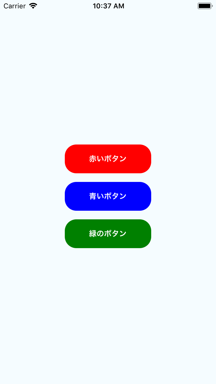
propsを使う
/* 省略 */

export default class App extends React.Component{
  render() {
    return (
      <CenterView>
        <StyleBtn color="red">
          <Text>赤いボタン</Text>
        </StyleBtn>
        <StyleBtn color="blue">
          <Text>青いボタン</Text>
        </StyleBtn>
        <StyleBtn color="green">
          <Text>緑のボタン</Text>
        </StyleBtn>
      </CenterView>
    )
  }
}

// styled-components
const center = css`
  justify-content: center;
  align-items: center;
`
const CenterView = styled.View`
  flex: 1;
  ${center};
  background-color: #f5fcff;
`
const StyleBtn = styled.TouchableOpacity`
  flex-direction: row;
  ${center};
  margin-top: 15;
  border-radius: 20;
  background-color: ${props.color};
  width: 150;
  height: 50;
`
const Text = styled.Text`
  color: white;
  font-weight: bold;
`
↑のようにStyleBtnのpropsのcolorでbackground-colorを指定することもできる
実行結果↓
まとめ
特別な知識がなくても問題なさそうなので導入しやすい
CSSそのものの記述ができるのがラク
native-baseなどにも使えて便利
jsxが綺麗になりそう