.bashrcと.gitconfigで使ってるaliasを公開する
.bashrcと.gitconfigのalias部分を公開
.bashrc
alias ..='cd ..'
alias ...='cd ../..'
alias ....='cd ../../..'
alias f='open -a Finder ./'
alias ll="ls -hlAFG"
alias cls="clear screen"
alias g='git'
alias gd='git diff'
alias gb='git branch'
alias gc='git checkout'
alias gcb='git checkout -b'
alias gs='git status'
alias gplu='git pull upstream'
alias gplo='git pull origin'
alias gplom='git pull origin master'
alias gps='git push origin'
alias gf='git fetch'
alias less='less -FSRXc'
alias ru='react-native unlink'
alias rl='react-native link'
alias nr='npm run'
alias nrd='npm run dev'
alias ni='npm install'
alias src='source ~/.bashrc'
alias spro='source ~/.bash_profile'
alias dc='docker-compose'
alias bashrc='vim ~/.bashrc'
alias bashprofile='vim ~/.bash_profile'

## 誤字が多いからエイリアス化する
alias gti='git'
gitコマンドの省略系が多い
clsは結構使ってる
次は.gitconfig
[alias]
    diff = diff --color | diff-so fancy
    graph = log --decorate --graph --name-status --oneline
    for-author = for-each-ref --sort=authorname --format='"%(committerdate:short)","%(authorname)","%(refname:short)"' refs/remotes --merged
    for-commitdate = for-each-ref --sort=committerdate --format='"%(committerdate:short)","%(authorname)","%(refname:short)"' refs/remotes --merged
    cp = cherry-pick
    master = !git checkout master && git pull origin master
    save = stash save -u
    changelog = !$HOME/.gittag-changelog/src/gittag_changelog.py
for-author,for-commitdateはgit fetch origin -pで取得したマージ済みのブランチを作成者(author)順か作成日(commitdate)順で表示するものです。ブランチ消す時とかに使います。masterは頻繁に使ってます。
goenvを使ってGo1.12.xの開発環境を構築する
1. goenvをインストール
goenvはHomebrewでインストールすることができますがGo1.12beta1までしか使えません
なので以下の方法でgoenvをインストールします。
HomebrewでgoenvのHEADをインストールする。
$ brew install --HEAD goenv
その後~/.bash_profileに以下の設定を追記する
export PATH="$HOME/.goenv/bin:$PATH"
export GOENV_DISABLE_GOPATH=1
eval "$(goenv init -)"
ターミナルでsource ~/.bash_profileを実行し変更を反映させる。
2. Goのインストール
goenv install -lでダウンロード可能なgolangバージョンを調べる- 欲しいバージョンをインストールする(例:1.12.6が欲しい場合は
goenv install 1.12.6を実行する)
3. Goの設定
goenv global 1.12.6で使用するバージョンを設定するgo versionでgo version go1.12.6 darwin/amd64と表示されれば完了
4. GOPATHの設定
- ~/.bash_profileに以下の設定を追記する。
export GOPATH=$HOME/go
export PATH=$PATH:$GOPATH/bin
source ~/.bash_profileを実行し変更を反映させる。
注意事項
brew install --HEADでインストールしたものはbrew upgradeでは更新されない
なので
brew upgrade --fetch-HEAD goenvで更新しましょう
HEADバージョンで入れたパッケージのアップデート
react nativeでのstorybookの使い方
storybookってなんぞや?
storybook(公式サイト)とはコンポーネント毎のスタイルガイドを作ることができるツールの一つです。
コンポーネントのカタログ集みたいなイメージです。
デザイナーと開発者の認識のズレをなくすためのツールとして使うことが多いようです。
今回は初期設定を紹介します。
開発環境
react native cli ... 2.0.1
react native ... 0.59.4
@storybook/react-native ... 4.1.18
react-native-storybook-leader ... 1.8.0
早速実装してみる
まずはnpm install
$ npm install --save-dev @storybook/react-native
通常通りコンポーネントを作成する。
/src/compoennts/atoms/button.js
import React from 'react'
import PropTypes from 'prop-types'
import { TouchableHighlight } from 'react-native'

export default function Button({ onPress, children }) {
  return <TouchableHighlight onPress={onPress}>{children}</TouchableHighlight>
}

Button.defaultProps = {
  children: null,
  onPress: () => {}
}

Button.propTypes = {
  children: PropTypes.node,
  onPress: PropTypes.func
}
作成したコンポーネントがあるディレクトリにindex.stories.jsがあることを確認する。
index.stories.jsを用意し作成したコンポーネントをimportする。
/src/components/atoms/index.stories.js
import React from 'react'
import { Text } from 'react-native'
import { storiesOf } from '@storybook/react-native'
import Button from './Button'

storiesOf('Button', module)
  .add('with text', () => (
    <Button onPress={() => {}}>
      <Text>Hello Button</Text>
    </Button>
  ))
今後は複数のディレクトリを参照していきたいのでreact-native-storybook-loaderを導入する。
$ npm install --save-dev react-native-storybook-loader
react-native-storybook-loaderは複数のディレクトリをstorybookにしたい時に便利なパッケージです。
設定をpackage.jsonのconfigに書きます。
package.json
{
    ...
    "scripts": {
        ...
        "prestorybook": "rnstl",
        "storybook": "storybook start"
    },
    "config": {
        "react-native-storybook-loader": {
            "searchDir": [     // 検索対象のディレクトリ
                "./src"        // 今回はsrcの中を検索する
            ],
            "pattern": "**/*.stories.js",  // どういう形のファイルが対象なのか
            "outputFile": "./storybook/storyLoader.js" // アウトプット先のファイル
        }
    },
    ...
}
storybookを起動する。
$ npm run storybook
にアクセス
別ターミナル (storybookを終了しない)でreact nativeを起動する
$ react-native run-ios
 ↑simulator画面
 ↑ブラウザ(localhost:7007)画面
まとめ
これでstorybookが開発を妨げることが少なくなりました。 今後もどんどん開発しやすくしていきたいです!
react nativeでstyled-components使ってみたい
react nativeでのstyled-componentsの使い方を紹介
styled-componentsとは
javascriptでstyleが書ける便利なやつ
こういうのをCSS in JSというらしい
同じようなものにemotionなどがある
どっちを使うか悩んだけど今回はstyled-componentsを使ってみる
使い方
前提としてreact nativeの環境があること
作者はreact native cliを使ってる
まずは準備
$ npm install --save-dev styled-components
準備完了。 実際に書いていく
StyleSheetなどを使って一般的に書く
import React from 'react'
import { View, TouchableOpacity, Text, StyleSheet } from 'react-native'

export default class App extends React.Component {
  render() {
    return (
      <View style={styles.center}>
        <TouchableOpacity style={styles.button}>
          <Text style={{ color: 'white', fontWeight: 'bold' }}>赤いボタン</Text>
        </TouchableOpacity>
      </View>
    )
  }
}

const styles = StyleSheet.create({
  center: {
    flex: 1,
    justifyContent: 'center',
    alignItems: 'center',
    backgroundColor: '#f5fcff',
  },
  button: {
    flexDirection: 'row',
    justifyContent: 'center',
    alignItems: 'center',
    marginTop: 15,
    borderRadius: 20,
    backgroundColor: '#E8483B',
    width: 150,
    height: 50
  }
})
styled-componentsで書く
import React from 'react'
import styled from 'styled-components/native'
import { css } from 'styled-components'

export default class App extends React.Component{
  render() {
    return (
      <CenterView>
        <StyleBtn>
          <Text>赤いボタン</Text>
        </StyleBtn>
      </CenterView>
    )
  }
}

// styled-components
const center = css`
  justify-content: center;
  align-items: center;
`
const CenterView = styled.View`
  flex: 1;
  ${center};
  background-color: #f5fcff;
`
const StyleBtn = styled.TouchableOpacity`
  flex-direction: row;
  ${center};
  margin-top: 15;
  border-radius: 20;
  background-color: #E8483B;
  width: 150;
  height: 50;
`
const Text = styled.Text`
  color: white;
  font-weight: bold;
`
centerのように共通のstyleをmixinで定義することができる
実行結果↓

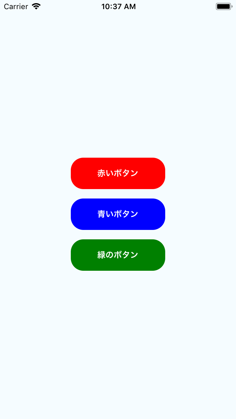
propsを使う
/* 省略 */

export default class App extends React.Component{
  render() {
    return (
      <CenterView>
        <StyleBtn color="red">
          <Text>赤いボタン</Text>
        </StyleBtn>
        <StyleBtn color="blue">
          <Text>青いボタン</Text>
        </StyleBtn>
        <StyleBtn color="green">
          <Text>緑のボタン</Text>
        </StyleBtn>
      </CenterView>
    )
  }
}

// styled-components
const center = css`
  justify-content: center;
  align-items: center;
`
const CenterView = styled.View`
  flex: 1;
  ${center};
  background-color: #f5fcff;
`
const StyleBtn = styled.TouchableOpacity`
  flex-direction: row;
  ${center};
  margin-top: 15;
  border-radius: 20;
  background-color: ${props.color};
  width: 150;
  height: 50;
`
const Text = styled.Text`
  color: white;
  font-weight: bold;
`
↑のようにStyleBtnのpropsのcolorでbackground-colorを指定することもできる
実行結果↓
まとめ
特別な知識がなくても問題なさそうなので導入しやすい
CSSそのものの記述ができるのがラク
native-baseなどにも使えて便利
jsxが綺麗になりそう